- UX for AI
- Posts
- Visual Guide to Android L Material Design: 7 Insights Every Serious Designer Needs to Know
Visual Guide to Android L Material Design: 7 Insights Every Serious Designer Needs to Know
It happened again. In the seemingly never-ending battle of mobile titans, someone moved your skeuomorphic cheese. And this time it was Google, with Android L Material Design. Here are 7 hard-won insights from 4 Material Design workshops I recently facilitated with my top clients in Argentina, Abu Dhabi and United States.
What is Material Design?
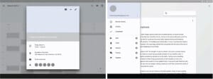
Material Design is a new Google design language that Google hopes to port to everything from mobile phones and tablets to websites and desktop apps — in short everything not including wearables (at least not at the moment.) You can get a feel for Material Design by seeing how Material Design transforms the Gmail app:
Starting from the current Android 4.4.4 (on the left), we
Remove some content complexity
De-clutter the action bar, remove the launch icon, and clean up fonts
Add standardized spacing on the 8 pixel grid
Add color and a substantial amount of vertical space, while also removing the overflow menu
And last but not least, we add a FAB (Floating Action Button) ergonomically positioned in the bottom right corner:

This example aptly demonstrates the contrast between Android 4.x and Material Design. Android 4.x used a “kitchen sink†approach to functionality, making as many options and tools as possible available to the customer using action bars, while the UI itself steps back (and ends up looking like a gray-scale wireframe). In contrast, Material Design represents concerted effort by Google to be highly selective of functionality and lay out the “happy path†for the customer, while making the interface cleaner and more visually appealing.
The seven Material Design insights I discuss below, help highlight the new developments and point out some possible issues and challenges weâ€ve run into along the way:
Skeuomorphism is Back
Color, Color Everywhere
Cards Tell the Truth
Junk Drawer
Full Screen Ahead
Pop Icons
The FABulous Button.
But first, a quick disclaimer: this article is NOT the official Google view of Material Design. This is my personal analysis of Googleâ€s new design direction, coupled with insights from four of my workshops. If you want the official story, there are plenty of YouTube videos from Google Keynote: https://www.youtube.com/results?search_query=material+design+google and the official Google Material Design Guidelines: http://www.google.com/design/spec/material-design/introduction.html This article assumes you have already reviewed some of the official material; itâ€s not meant to replace the official Word From on High, but instead to complement, interpret and point out the shallow spots to help you navigate the treacherous waters.
OK, with that disclaimer out of the way, letâ€s dig in!
1. Skeuomorphism is Back
Call it a third dimension… Or mysterious “Z-Depth  Skeuomorphism is back:

You can see it in the drop-shadows, the so-called “Step†and “Seamâ€:

and in the treatment of the (finally standardized) modal popup layers and drawers that sit very obviously right on top of the main content:
Even Google designers themselves explain the design process as one using analogs of “paper and ink†and showcase the Material Design methodology using pieces of paper and wooden disks (according to Googleâ€s official video titled Google I/O 2014 – Material design: Structure and components, http://bit.ly/1dpmaterial):

In order to preserve trees, we’ve been using these round stickies (see below) instead of the wooden disks in our lean mobile UX design workshops. Otherwise, Google is using the same low-fi paper prototyping process weâ€ve been using in over 50 workshops in 10 countries. It is described in detail in my new book, $1 Prototype: A Modern Approach to Mobile UX Design and Rapid Innovation for Material Design, iOS8, and RWD, now available for pre-order on Amazon.com:

The physicality (skeuomorphism) of the Material Design interface that makes the $1 Prototype method described in the book a perfect fit for designing and prototyping Android L Material Design apps. You can view some of the videos from our previous workshops at our YouTube channel: http://bit.ly/1dpvideo
2. Color, Color Everywhere
Fundamentally, many of the same Android design patterns are still around:

But with one big difference—they are now much more colorful!

And larger screens get even MORE color with tall bold header elements and blueberry drop FAB buttons, right out of the Willy Wonka movie:

Even simple forms and UI elements (like the on/off switch and text entry field) get unabashedly psychedelic, with a heavy dose of 60s contrasts, Woody Allen, Andy Warhol and LSD… Groovy, baby!

In Android L Material Design you now have the capability to bring any color you want dynamically to any part of the on-screen UI. Itâ€s also supposed to be fashionable to bring in color that matches the image content on screen using powerful new image analysis libraries that allow screen controls and chrome to complement and/or match a portion of the image content:
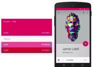
While I understand the attraction of bringing the accent color to FAB buttons, itâ€s less clear why we should also want to render the notification bar (one of the least useful elements on the screen) in the brightest possible hot pink color. Although it shows off the impressive new Material Design capabilities rather nicely,
I personally do NOT recommend making the notification bar the brightest thing on the screen. Call it the Jurassic Park Principle: “Just because you can do something, doesn’t mean you should.â€
Another reason to be very careful with color is accessibility. If you look at the purple form above you might note that the contrast between the background and text is nowhere near as clear as the rest of the form. Add to that the challenge of a bright background, and you might end up with a situation where a good portion of the population (5% or more) might have trouble seeing your form entry fields and labels. And thatâ€s even without mentioning direct outdoor sunlight and low-color-fidelity displays in cheap Android phones (that render seriously weird colors that would have given even Austin Powers a headache). In my tenure as a designer, I learned to use bright colors sparingly. And while it is easy to get excited, it pays to consider accessibility carefully.
The treatment of the notification bar (dark red) is much better in the new Gmail app, where it matches the red “app bar†(freshly renamed from “action barâ€). This screen also demonstrates another important trend: using the launch icon color for in-app branding:

3. Cards Tell the Truth
You can see the cards everywhere in the new Android L, from app interfaces to task-switching:

Cards are now a dynamic and powerful concept with additional functionality that is capable of skeuomorphic behaviors much like a deck of physical cards, in this example of task-switching UI:

According to Google Cards are best for:
Combining different types of content on the same screen
When item size variable
When managing complex items (heterogeneous content w/ multiple actions)
Here are two new Material Design screens that demonstrate salient points:

At the same time, Google cautions against the recent trend of “over-cardification†that is, making cards out of a bunch of similar items in a list:

Based on these guidelines, it seems clear that Google does not want you to cardify long homogeneous textual lists (like a list of emails). Yet this directive confuses many people. Based on my teaching experience thus far, I believe this is due to confusion about what represents a “cardâ€.
For example, these new Material Design screens showing long homogeneous lists of photos (of different sizes) that look a great deal like cards… With maybe a smidgen less of a drop-shadow:
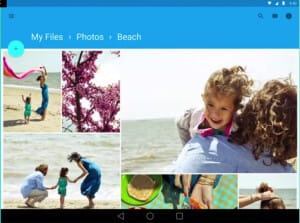
So we are still somewhat in uncharted territory insofar as “photo cards†are concerned.
My basic recommendation is that any homogeneous list does not need to be cardified. There should be clear multiple calls to action on a single item to warrant making it into card.
4. Junk Drawer
I first spoke of using Drawer for navigation at the Design4Mobile conference in Chicago in 2010, just a few months before Facebook released the first drawer for the Facebook iPhone app (I claim no credit for Facebook design—just a case of “minds thinking alikeâ€, and all that). After that initial memorable Facebook design, Drawer became an important functional element that achieved widespread acceptance in Android 4.x design scheme. Likewise, in Material Design, you can also find the Drawer at every screen resolution:

There is an important difference however: Android L Material Design specification is far from recommending the Drawer as “standard equipment†for all apps—for the first time, Google points out that there are both positive and negative aspects of the Drawer:
Negative: “Drawer leads to reduced visibility and user awareness.â€
Positive: “Drawer supports large number of top-level views, convenient cross-navigation.â€
Another important change is what goes into the drawer. Recall that in Android 4.x admin tools and other “junk†(such as Settings, Help and Login/Logout functions) went into the overflow menu (3 vertical dots on the top right-hand side of most screens). Google was adamant about this, and required these overflow menu items in order to even consider the app for featured status.
In contrast, in Android L, so far, overflow menus appear to be quite rare. Instead, admin tools and “junk†(including Settings, Help and Login/Logout) end up in the top level Drawer.
For example, take a look at the new Material Design Calendar app:

The contents of the Calendar Drawer are no longer the “top level navigation†or even “a transient homepageâ€. They are basically filters and other junk you normally want to hide, including very notably the Settings function. This clearly points to the new Material Design Drawer becoming a kind of a catch-all “junk drawerâ€.
In my opinion this “junk drawer†that contains Settings is a welcome alternative to requiring access to Settings in overflow menus on every screen. However, the question of navigation is now more muddied than ever. If the Drawer does not represent top-level navigation (as in the Calendar drawer above) it is not nearly as useful. Should we still allow access to the Drawer from every screen?
Should we, for example, plan to break the Material Design conventions even before the new OS is even released from Beta? Maybe in favor of some alternative solution, such as the innovative iOS8 Amazon.com app navigation that allows both the back button and drawer access from the same bar? (Only we would be using the “<” as the “up” button instead, since Android already has the hardware “back” button):

In the end, it’s the Highlander face-off: “there can be only one!” For now, in Material Design, if you do use the Drawer, you dispense completely with the “up” button, which is supposed to go into that same top left position on the app bar. There does not appear to be a Google-approved way to implement both the “up” button and the drawer together. The only way to support “large number of top-level views, convenient cross-navigation†is to use the Drawer together with the hardware back button.
5. Full Screen Ahead
Speaking of Drawers, collapsing panels of all kinds are “The New Normalâ€. In Material Design, The Content is in the role of Misha Baryshnikov, confidently taking center-stage. Correspondingly, the hidden panels and Drawers of all kinds now come in a wide variety of implementations and purposes. For example, this aqua-colored overlay teaser that hides advanced calculator functions can be deployed by swiping from the right edge of the screen. Interesting possibilities!

App Bars and Toolbars (new terms which now replace “Action Barsâ€) routinely hide-away when scrolling:

Letting the content really shine!

Parts of the screen made up of separate “pieces†of “digital paper†can also scroll away, allowing us to configure the screen for optimal interaction at all times. Check out the fabulous disappearing act of Ali Connors, from this Contacts detail screen:
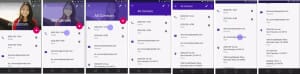
As the Ali Connorâ€s contact details keep on scrolling, they hide the app bar as well, displaying the full-screen contact details.
Note especially the disappearance of the pink FAB (Floating Action Button) — we can only assume that the “Mark as Favorite†function is now accessible in the overflow menu. It is less than clear if this function was always in the overflow and was doubled up in the FAB, or is the “Mark as Favorite†function is placed in the overflow menu dynamically, only when the FAB disappears. If itâ€s the latter, well, configurable menus are nothing new, but they tend to be much more confusing.
We will wait to get more information to see what Google has in mind, but for now this is something to keep an eye on. Note also the variety and interesting use of icons, which brings us to the next section…
6. Pop Icons
Android L Material Design specification promised to standardize the icons on a single icon set strictly specified and created by Google. Hereâ€s a sample of what these new minimalistic icons look like:
Google recommends that these icons be used consistently throughout your app.
Unfortunately, this quickly leads to confusion when you mix function and navigation. In the example below, the “trashcan†icon has dual meanings: “delete†and “navigate to deleted itemsâ€. As we found in our workshops, this can be very confusing to potential customers:
This confusion about “function vs. navigation†is something that is likely to cause some friction for Material Design implementations that play it strictly “by the bookâ€. One simple hack we designed for one of our clients was to reverse-out the “navigational†icons we used inside the Drawer and put them in a circle. This hack appears to solve the problem, while still (albeit loosely) sticking to Googleâ€s directive of “same icons for everythingâ€.
Another interesting point: in the screen below, where do you think you should tap to call Ali Connors?

If you answered the purple phone icon, you are likely wrong: we theorize you have to tap the phone number itself! This is significant, because in user testing during our workshop, 100% of the people initially chose the wrong action.
And to launch the Google Hangout with Ali Connors, you have to tap the more muted, smaller gray “quote in a speech bubble†icon next to the phone number. This interaction also confused participants: the “quote in a speech bubble†icon was both “strangeâ€, and looked a lot less prominent than the section icon (“phoneâ€) rendered in bright purple color. Some participants even thought the Google Hangout icon was disabled!
Fortunately, this situation is far from hopeless. I think section icons are an exceptionally fine idea. One simple fix is to reverse the colors assignments: make the decorative section icons (e.g. “phoneâ€) the muted gray, while rendering the functional (“quote in a speech bubbleâ€) Hangout icons in the brighter color. However, be aware that even despite these changes, for situations where there is only a single active element in the section (like a single phone number for example) the section header icon can still cause some confusion. To combat this, consider assigning a reasonable function to this icon: for example, tapping the section icon can call Ali at the number on the top of the section.
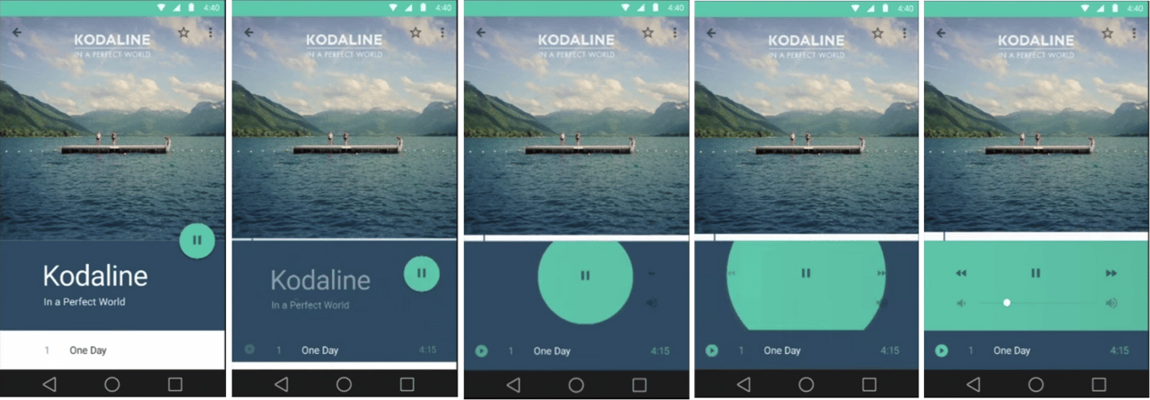
7. The FABulous Button
The buttons in the Android L Material Design are getting standardized down to three types: Flat Button (general use for most functions), Raised Button (primary action), and FAB (Floating Action “zeitgeist†Button):

FAB is the new addition to the Material Design vocabulary, and it is supposed to be very much a “sometime†button, meant for positive actions that are most strongly characteristic of the appâ€s primary function (or “zeitgeistâ€, as I wrote in my $1 Prototype book). Here are two examples: Music Player app with Pause/Play FAB and Maps app with driving directions FAB. Both are “happy path†functions, deeply embedded in each appâ€s DNA, per Googleâ€s design guidelines:

One important point: FAB is supposed to only represent functions that are positive:

Unfortunately, for many apps, the destructive or “negative†action are often the most likely actions on a particular screen. For instance, for email, “Archive†and “Delete†are by far the most likely actions on the email detail screen, but putting an “Archive†FAB into email detail screen would go against Googleâ€s new design guidelines, because both are “negative†and destructive actions.
The alternative for email is to add a “Reply†FAB—not anywhere near as useful as “Archiveâ€. So depending on your app, you may still end up wanting a “negative†FAB, just be aware that this would go against the guidelines, which means you will be less likely to get featured.
Last but not least, many of my clients asked if Google plans to make FAB semi-transparent. While I know of no such plans, such a move would make a great deal of sense to me. Iâ€ve been recommending semi-transparent “menu†corner buttons as part of the “Four Corners†design pattern since my Design4Mobile talk in 2010:

Which brings us to my last point: rather than treating Material Design as a problem to be wrestled with, consider it a permission to experiment with various new design patterns. Despite some early challenges (some of which we covered here) Material Design represents a tremendous opportunity to standardize, simplify and generally make your app easier to use and more attractive. But you have to be willing to experiment and try out these new patterns. I recommend combining designing and prototyping into a single activity using inexpensive sticky notes prototypes. Once you make your prototype, you can jump into Rapid Iterative Testing and Evaluation to with your customers to understand quickly what works and change what doesnâ€t. I describe the approach in detail in my new book, $1 Prototype: A Modern Approach to Mobile UX Design and Rapid Innovation for Material Design, iOS8, and RWD is now available for pre-order on Amazon.com:

This inexpensive iterative prototyping process that simulates digital paper makes sense for Material Design—as Rich Fulcher, Senior UI Designer at Google and one of the people behind bringing the Material Design to the market said:
“We spent a lot of time actually cutting out pieces of paper, and layering them and moving them, till we came up, within this [Material Design] system with views that made sense. I really got to hone my scissors and glue skills working on this project. We even used… little wooden disks to track the floating action button… Playing with paper is just a great practice for getting a sense of how this design system works. It really gives you a feel of how the surfaces will interact with each other… shuffling the paper around physically helps you understand [various interactions] very quickly. Itâ€s really fast, really cheap, and a kind of fun way of designing†(See Google I/O 2014 – Material design: Structure and components, http://bit.ly/1dpmaterial)
So thatâ€s it for our review. I continue the topic in the new $1 Prototype book, where I discuss which screens need a FAB and provide detailed examples of modeling and user-testing Material Design screens and new transitions, like the one I nicknamed “FAB Octopus Burst†shown below:
The $1 Prototype: A Modern Approach to Mobile UX Design and Rapid Innovation for Material Design, iOS8, and RWD book is now available for pre-order on Amazon.com for $5.99 (40% off regular price).
[signature]
Reply