- UX for AI
- Posts
- 7 Mobile Trends for 2014 (and How to Profit From Them – with Case Studies!)
7 Mobile Trends for 2014 (and How to Profit From Them – with Case Studies!)
I was very pleased that our last “7 tips” article dating back to 2012 received so much readership and media attention, and how “on the money” these predictions have been in 2012 and 2013. Of course, this puts tremendous pressure of a repeat performance on this article, as we attempt to predict the key developments and trends for 2014-2016.
The importance of mobile to your company’s digital strategy cannot be overstated… But where to focus your energies? The answer will of course depend solely on the nature of your business and your goals for the coming years. That said, here are 7 trends we see emerging in many of our clients’ businesses, from financial and banking services to ecommerce and social media:
#7: Lean will Mean Business
All of the successful companies reaping billions from their mobile apps (Amazon, eBay, YouTube to name a few) realize that mobile is but a small piece of a larger game. Customers may begin the shopping “trip” on the mobile phone during the morning commute, then do a bit more research on the website on their office laptop during lunch, before finally pulling the “buy” trigger while on their tablet app later that evening. Mobile-savvy companies realize that the mobile experience, while complimentary to the web, is nonetheless something that cannot be simply copied to the smaller device. In fact,
mobile has certain unique strengths that make it imperative to design the interaction from the “ground up”: instead of “dumbing down”, the key workflows need to be “mobilized”.
One great example of a cross-platform experience is WebEx, and we are proud to have helped the leader in online meetings to take the experience to the next level by bringing immersive video conferencing to all the major platforms: mobile, tablet and desktop (see WebEx and 7 more Case Studies here). Note that each device’s UI is unique — together with uber-awesome WebEx designers and product managers, we worked on designs that bring out the best of every platform, while creating a recognizable coherent branded experience across the board. Which simply means, if you use WebEx on the desktop, you don’t have to think too hard to move to mobile or tablet: despite the difference in screen sizes and form factors, the controls are consistent and system behavior is intuitive. And we did it in just a few short months.
How did we pull this off? The answer is the age-old UX wisdom of obsessively focusing on the customer, using Lean, Agile prototyping and RITE (Rapid Iterative Testing and Evaluation) as the core of the design process. As Jakob Nielsen so eloquently stated:
“There are no secrets of usability any more than there are secrets of astronomy. If you point your telescope at Saturn, you will see that it has rings.” (ref)
As our appetite for cross–platform (and particularly mobile) experiences grows and becomes more sophisticated in 2014-2015, Lean Agile approaches to design, centered squarely on user testing as the core of the process will be essential for understanding the complex interplay of various factors that help your customer experience unfold across multiple devices.
The age of the Persona is passing — the new digital experience design approaches based on understanding the Context of the customer engagement and developing the optimal service scenarios should now be the primary focus of your research and development.
A two-prong approach of scenario-based storyboarding to help your teams understand the larger picture of how people engage with your product or service, coupled with Lean contextual testing of paper-based mobile prototypes integrated into the Agile software development process will be the key to success.
I have perfected the Lean mobile design approach, having worked through dozens of client projects and taught 1000’s of people around the world in 40+ university-accredited classes, workshops and industry presentations. Here’s one such example from my 2013 Agile Mobile Design workshop at MobX Berlin:

Having had long, multi-faceted experience with the Lean mobile design methodology, I (as many UXers before me!) am happy to report that it works exceedingly well. This method is fast, reliable and cheap — it just works.
Based on popular demand from many workshop attendees, I’m currently writing my book #4 with a working title: “Lean Mobile UX Design: Common Sense Approach to Getting Awesome Apps to the Market Quickly” — due out sometime in 2014. (No pressure now, but if you, the gentle reader, would like to be one of the early reviewers, please sign up for a Free Android Design course based on my 3rd book: Android Design Patterns: Interaction Design Solutions for Developers (Wiley 2013) by clicking here or filling out the form at the end of this article.)
Incorporating even a small amount of Lean UX design methodology into your own work in 2014 will help you understand your customers’ goals and context better, innovate with confidence, and create excellent mobile apps.
#6: You Will be Assimilated
Don’t worry about Windows phone and throw away your Blackberry (sorry Canadians). While the competition in the US has Android and Apple running neck and neck, the picture for the test of the world outside the Silicon Valley is quite different. Despite the fact that I love all 6 of the Apple devices my family owns (I especially love the battery life), world-wide OS contest is officially over (for now):

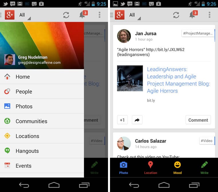
Yes, the recent China Apple deal will help Apple, but it cannot stem the tide of the more open, device-independent Android OS. There are many good reasons behind Android’s surge in popularity. Android 4.x is a mature, grown up OS and it’s ready for (your) business. And it looks fantastic: striking the right balance between no-nonsense pure digital artifacts, scalable navigation and branding, as exemplified by these screenshots from Bank Simple:

If you want 1 take-away from this article, this is it: the success of your digital strategy depends on taking Android 4.x seriously.
Which brings us to one of the many challenges presented by Android: that of fragmentation.
#5: Tablets Will Rule
Like a fragmentation grenade in a ball-bearing factory, the number of different Android devices and form factors has simply exploded in the past 2 years. The most recent count reported in 2012 tallied in at 3,997 devices, which means that at the very least, you have to be able to design for 3,997 Androids (plus the 4 Apple device form-factors: iPhone 5, iPhone 4, iPad and iPad mini).
No matter the OS, designing for different form-factors continues to be challenging.
The design is especially challenging for tablets for two reasons. First, because the tablet patterns beyond the simple Split View and Fragments are simply not as well established, and second, because tablets of any OS, despite their appearance, are simply not “large phones”.
Tablets are held and manipulated very differently, resulting in very different ergonomics, as compared with the common right-handed grip commonly seen with full-size mobile phones:

The “hot zone” for controls for tablets lies along the edges of the device close to the top of the screen, but does not cross the middle. That’s because most people hold larger, heavier and more expensive tablets like the 9-inch iPad and Galaxy Tab 10 with a secure, 2-handed grip, frequently also resting the bottom of the device on the lap or the tabletop. This means that the control scheme that both Google and Apple keep insisting on — namely, bars on the top and bottom of the device, are actually rather difficult to reach while holding the device in the most common grip.
The worst offender is Apple, which even in the new iOS7, stubbornly clings to putting the iPad tab bar on the bottom of the screen, where it’s difficult to see and even harder to reach:

Android is not perfect either: although the Android action bar scheme is supposed to scale well for all sizes and device types, it works best for mid-size, 7-inch tablets and often breaks down on the larger 9 and 10+ inch devices. In my 3rd book, Android Design Patterns: Interaction Design Solutions for Developers (Wiley 2013), I use a pure ergonomic approach to identify 5 key device types that allow you to design excellent UIs for a wide variety of devices.
But to come back to tablets — what’s is the best design approach?
For a truly natural feel, and a flowing, effortless experience, I highly recommend considering custom side navigation, like the one featured by Twitter’s iPad app:

and Saba (Saba is our client, and we’ve been proud to work with them on some amazing new mobile and tablet designs and enterprise data visualizations in 2013):

For larger tablets, side navigation fits the ergonomics of the device far better than the traditional top and bottom navs, because the typical dual side grip ends up perfectly aligned with the app controls. This control placement also works reasonably well for the new touch-capable Windows tablet-laptop convertibles (which are a whole other beast outside the scope of this article.) My prediction is that you are going to see a lot more side navigation for tablets in 2014 and also that once again, tablet UIs are going to be the defining differentiation factor for many companies. Which brings us to our next tip:
If you want to stand out in the marketplace, create a smashing tablet experience.
We are proud to have been Intuit’s design partner in creating state of the art tablet interfaces for some of their key financial tablet apps for iOS7 and Android 4.x (currently under NDA).
#4: You will Muddle Through Flatland
It’s true — you no longer need to hit your customers over the head with skeuomorphic design, and “real life” buttons, faux-realistic textures, drop shadows, and real object behaviors, which scream, “Tap here!” Flat design is here to stay, completely embraced (at least for a moment) by all major mobile operating systems. Unfortunately, as saying goes “nothing is more complicated than simplicity”. This adage never rang truer than on the subject of flat design.
Although the flat UI appears to be very simple, subtle clues that work for Apple and Android native apps often get the rest of design world in loads of trouble. In particular, this has to do with concept of “affordances” (that is the extent to which a given interface component communicates how to interact with it). The problem is that:
when the call to action is minimized in the flat design schemes of iOS and Android, everything on the screen becomes a touch target, or even more complicated — a gesture target.
For example, in this iOS7 weather app, the huge temperature display can be tapped to drill down for more information, but even less obvious, the entire screen can be pinched (a hidden gesture!) to get to a list of locations:

Pinching is a hidden gesture, a delighter — and although it is difficult to discover initially, once learned, it is spectacularly “intuitive” and “sharable”.
Unfortunately, unless a friend or a commercial shows how to use a certain feature, the flat design’s lack of affordance leads to almost universal confusion as the customers attempt to make the best of the app by learning as they go (known in the UX industry as “muddle through”, which is about as much fun as it sounds). Expect more cognitive friction of this type in 2014, as the world adjusts to learning how to operate on flatland.
How can you create apps that are easy to use yet provide a hidden garden of delights? At the core of the design process,
the product team needs to understand first-hand the goals and use-cases in context, with a real-life sized object prototype (such as a pack of sticky notes) used to probe the specific steps and types of gestures that the customer is likely to want to perform in order to accomplish their task.
Then the team needs to build the product accordingly, to support those gestures with functionality that meets the customer expectations and contributes to the overall experience. I already mentioned Lean Mobile Design methodology above — I think it’s “exactly what the doctor ordered” as a fast, inexpensive way to understand customer goals and test out various strategies, while helping you to accurately model tactical specifics of the interaction in the given workflow. In my next book, I will lay out the entire methodology — stay tuned by signing up for my free Android course below, attending one of my upcoming workshops, or scheduling a custom training workshop for your product team.
#3: You Will Type Less
I predict that:
the highest app growth in 2014 is going to come in the form of apps for getting the data in and out of the mobile devices gracefully.
While QR Codes are in decline, the NFC technology is just getting its second wind. Apple’s own proprietary connectivity tech, Bluetooth Low Energy (BLE) iBeacon will put a damper on the NFC growth, but will not stop it, as NFC is the preferred way for Android devices to communicate with the physical objects and location in the outside world. I predict that the battle between BLE and NFC will play out in 2014-2016.
Most likely the two “Internet of Things” technologies will eventually end up complementing each other — NFC is cheap enough to put in every physical object, while BLE, although more expensive, has a much longer range.
Other technologies to undergo evolutionary change will be anything to do with scanning real-world objects using the on-board camera. Take for example the USAA Bank’s auto-scan — the evolution of the photo deposit, which allows customers to scan the check automatically, using a completely touch-free experience:

We are proud to have partnered with USAA Bank in 2013 to help make what many people consider the world’s best banking experience even better (see this and 7 more Case Studies). Not surprisingly, leading financial technology providers, such as Mitek are quickly following suit with their own auto-scan systems.
I predict that 2014-2016 will be the years in which the image scanning explodes, allowing everyone with a smartphone to scan and recognize all kinds of physical objects, from documents, to products, to landmarks, to peoples’ faces.
In addition to using the on-board camera,
facilitating voice input will be a priority in 2014-2016, as more and more apps integrate with Siri and the Google Voice Assistant technology for everything from data entry to secure authentication. Likewise, getting the information read out to you will be just as crucial, as car integration and multi-tasking will be gaining even more importance in the coming year.
I predict that we will also see voice input being used as an accelerator in tablets and on the desktop as a shortcut to jump across multiple tedious steps of a frequently performed task. Look for Android voice and facial recognition on cheaper universal hardware to complement Apple’s much more expensive thumb scan. My Cross-Channel Touch UX Design Framework, should be particularly helpful in understanding how your current experience measures up and where to move it next.
#2: You Will (Multi) Touch More
Recent redesign of Youtube busted the long-standing idea of a “simple tap”, while at the same time proving just how difficult it is to port a design between platforms. Observe how a simple detail — having the hardware back button, makes navigating back to search results on Android easy with a single tap:

— yet because the hardware back button is missing in the iOS version of YouTube app, the same simple, frequently used action of navigating back to search results is made ridiculously difficult to accomplish in the iOS version, requiring everyone to go through the “picture-in-picture” feature, which requires two complex swipe gestures!

Personally, I’d really like to see a quick fix for the iOS version, adding a simple back button, without taking away the “picture-in-picture” capability accessed through multi-touch. The resulting fix can look like the wireframe I made below:

Had the YouTube designers used the Lean sticky notes methodology to test the design before building their app, it would have been easy to include this elementary fix from the beginning, avoiding any “black marks” against this otherwise exceptional app.
Despite these challenges, YouTube redesign is a notably successful, and I predict other companies will follow with complex gesture and multi-touch use frameworks that will find particularly spectacular implementations on tablets. This “Golden Age of Multi-Touch”, has long been predicted by both myself and Josh Clark (Twitter: @globalmoxy). Josh’s long-standing favorite — a 5-finger pinch gesture, is now Apple’s own official alternative to the home button on the iPad (try it!).
The next 2-3 years, will see the rise of complex tablet gestures such as two- and three-finger taps, complex swipes, as well as pan and zoom gestures with virtual reality overlays that will allow you to literally “play” your app like a musical instrument, so no two experiences will be alike.
But what is the best way to communicate these wonderful additions to our interfaces — especially given the flat design of the modern touch OS?
If you want your customers to succeed with your gestures and multi-touch, in addition to the Lean design methodology I described above, you will have to take the time create a well thought-out Welcome experience — but heed well the lesson of Clippy! As Alan Cooper said in About Face: “do not stop proceedings with idiocy”.
The complex and interesting interactions you designed need to be introduced gradually using a Watermark (also called Coachmark) design pattern.
I describe Watermark in detail in Chapter 5 in my Android Design Patterns book (you can see some screenshots here). This way you will ensure people will find these hidden gems and get full use and satisfaction from your app.
#1: You May Compete to be Featured (or Not)
With the recent overhaul of both iOS and Android operating systems, the pressure is on once again in the race to become Featured in the App/Play Store.
Recently Amazon.com was one of the companies that undertook the iOS6 –> iOS7 conversion. Unfortunately, while the new iOS7 app adheres to the Apple standard, the customer experience has not gained much in the conversion process:

Will a simple conversion like that be enough to get your app featured by Apple or Google?
Not bloody likely.
Big winners in the Featured war go beyond “simply” redesigning for iOS7 or Android 4.x. Instead, successful companies
Take the time to go beyond skin-deep redesign for both Apple and Android OS upgrades, using the OS upgrade as an excuse to overhaul their information architecture and key workflows with modern design patterns and graphics, as we have helped Intuit do with TaxCaster iOS7 conversion. We are delighted to have helped Intuit get their shiny new TaxCaster app featured by Apple as their iOS7 app of choice in the Financial category (see TaxCaster and 7 other case studies here).
In your redesign you too should consider modern design patterns such as the Drawer:
and Wizard Flow with Form (see Chapter 12, Mobile Banking in Android Design Patterns book — you can get a quick preview in my Essential Patterns for Mobile Banking article on Smashing Magazine):

I should mention that you are likely to have easier time porting your existing apps from iOS6 to the new translucent flat look of iOS7 than from Android 2.x to Android 4.x.
Which means, that
At the moment, Featured status is slightly easier to achieve for Android apps, as fewer of the big boys have undertaken the Android app conversion and the competition is still light.
But don’t wait too long: the window is closing fast.
Once the big companies come to terms with and recognize that Android 4.x is here to stay and upgrade their apps to the latest 4.x version, the window will once again be closed until the next big OS upgrade.
I predict that 2014 will be the year of Android 4.x — in fact our company pipeline is already at near capacity with projects of many of our Fortune 500 clients doing just that.
On the other hand,
we also see some of our clients bypassing the featured app battle altogether, and instead concentrating on creating what we call “Equal Opportunity Offender” apps. In other words, apps that carefully cultivate a specific branded look and feel that is neither pure iOS nor pure Android, but instead offers a consistent, customized experience that is nether iOS nor Android.
Apps like Flipboard, Yelp and Facebook, to name but a few.
Some clients do this for the purposes of unique branding, others to help push out rapid content upgrades or scale to multiple devices and save money on development costs by incorporating responsive HTML 5 features for some, or all areas of their app. Although not implemented using native code, these pages run reasonably well and can scale for most device form factors.
While each approach is very different, they are valid for meeting different business and UX goals. Which one should you pick? With 3 books, 40+ presentations, over 50 articles, and many successful design projects, we are the mobile experts. We know no size fits all, and we would be glad to help you select the digital strategy that works, while meeting your goals and budget.
Ready to get the most out of mobile in 2014? Let’s talk.
Thanks for reading and Happy 2014 — make it great!
[signature]
Reply