- UX for AI
- Posts
- How to Create Figma Tables for AI Designs in Less Than 3 Minutes
How to Create Figma Tables for AI Designs in Less Than 3 Minutes
We boil down almost four decades of design experience to demonstrate how to best create tables in Figma (as well as other standard components) in the age of AI. We offer a simple, straightforward, and highly practical approach to creating tables in Figma that allows a typical table to be built live on a Zoom call in under 3 minutes.
Greg Nudelman
July 10, 2023

MAGE CREDIT: Midjourney /imagine a bunch of spreadsheet tables on a large overhead monitor, people looking at them confused in the style of arcane.
In this installment, we’ll boil down almost four decades of design experience to demonstrate how to best create tables in Figma (as well as other standard components) in the age of AI. We offer a simple, straightforward, and highly practical approach to creating tables in Figma that allows a typical table to be built live on a Zoom call in under 3 minutes. Using the simple method we share, you can drastically reduce UI bugs, eliminate confusion, and shorten the design cycle, which is critical in today’s 24-hour worldwide remote design and development process. This approach effectively frees designers, developers, and PMs from “robot/AI work” so they can spend more time on “human” tasks researching, discovering, inventing, and creating.
Sounds good to you?
Read on!
Why Tables?
Many fantastic existing and novel visualizations have been leveraged to communicate with AI tools effectively (and we’ll share many of them in future installments of this column.) So why are we talking about something as prosaic and ordinary as tables?
Simply put, because tables work. Tables form the backbone of a typical SaaS design project. Whatever AI project you will likely work on, tables will be involved somewhere.
So it makes sense then that everyone in the design community is on the same page about how to create tables, right?
Not quite.
What’s the Problem?
In the UX community, there is a great deal of variability and confusion about creating designs for this most commonly used design element. Over the past two decades, Fireworks, Omnigraffle, Sketch, and many other design tools struggled with table creation. We hoped that the new UX industry darling, Figma, would finally make this problem disappear – maybe by creating a plugin or posting a best practices video. Alas, that has unfortunately not yet occurred. And so, thousands of Designers, Developers, and Product Managers collectively waste millions of work hours redesigning the same fundamental component. And most folks do this in a less-than-ideal way, resulting in wasted prototyping clicks, throw-away code, unnecessary team arguments, confusion, bugs, lower-quality user interfaces, lack of consistency, etc. In other words, loads of time goes wasted on low-level alignment. The time that is better spent on high-value creative activities like user research, vision prototyping, and RITE (Rapid Iterative Testing and Evaluation).
Cells are OK.
When creating tables, naturally, everyone starts with a cell. A typical design system gives the cell some properties, such as whether it has a leading or trailing icon, alternating color, borders, etc. There may be a selection color, likely a mouse-over color, or another color that denotes selection with a row checkbox. Sometimes there is even a color that denotes a special row status. Then the same design process is repeated with a table header – mouse over, click color, sort indicator, leading, and trailing icons. Cells are the basics, and most teams create them more or less successfully.
In our experience, it is after the cell is defined that the real problems begin.
Some “Less Resourceful” Approaches to Creating Tables
Some “less than resourceful” approaches to creating tables are:
Do nothing – let the designers create the entire tables one cell at a time.
Creating long (and we do mean LOOOOOOOOOOOOOOOOOOOOONG) columns of cells of 20, 50, or even 100! Cells inside a column remain undefined.
Creating rows of different colors to indicate selection, mouse over, and the like.
Creating entire tables of 5,6,7,8,9,10 etc. columns, where all cells are blank and undefined, with a hundred rows each, all with elaborate automatic Figma layouts.
...And the Troubles They Cause
Choosing one of the relatively loose arrangements described in the previous section results in one or more of the following issues:
Putting together a table takes BLOODY AGES. (Forget doing it live on Zoom call! Which means multiple 24-32 hour review cycles in a globally distributed team.)
Content alignment is often incorrect. (Often, designers inadvertently create center- or left-aligned Number columns, right-aligned Name columns, center-aligned Date columns, etc.) Well-meaning developers then push this bug into your product.
Hard to create new content from scratch for every cell. (Do you know from memory how your date column is formatted?)
Hard to adjust the width of the column as a set. (Every designer re-invents how they group their cells afresh, so it takes a long time to figure out how each bespoke table was constructed, leading to wasted time if you are trying to make even a tiny change to someone else’s table.)
Text wrapping is handled poorly (as this is hard to do in a column of generic cells.)
There is no consistency from one design to the next, resulting in little or no code consistency and reuse.
Lots of UI bugs. Content alignment (mentioned in point 2) is just the tip of the iceberg. We typically find multiple colors, fonts, margins, truncation, and format changes from one table to the next.
Designers inadvertently create cell variations unsupported by the code (e.g., some cells have two statuses, for instance), leading to custom code as developers are desperately trying to do their best to accommodate the design decisions taken in isolation from the rest of the team.
PMs feel compelled to suggest column variations that are outside the realm of best practices – for example, randomly moving the status icon from left to right because “AWS does it this way and our users use AWS. Therefore, they will be ‘less confused’ if you do it this way, and I like it better, so do it” (and nevermind hundreds of pages in your application that put the status icon on the left).
Developers randomly decide to encode standard values differently: for instance, the boolean column values can be encoded alternatively as yes/no, Yes/No, true/false, True/False, 1/0, Y/N, y/n, etc.
No consistency in column titles from one page to the next (Date, Created On, Created at, TimeStamp, Date-Time, etc.)
Heffalumps and Woozles
Also, large bugs, men with pointy teeth…
Stop, no more. You'll just upset me!
The 3-Minute Table Solution
The 3-Minute Table Solution is our answer to the challenge of table creation.
It is a simple design system consisting of the following:
2-5 individual cell types (left-aligned, right-aligned, center-aligned, status, etc.)
Default and Select variants for each cell type.
Default, Sort up, and Sort down variants for the table header.
20-40 pre-set five-cell column elements, each complete with a header and sample content, a sort indicator (if applicable), correctly resizable, with carefully adjusted cell-level text truncation.
That’s it.
The whole “3-minute table solution” is so simple that it fits in a single screenshot:

Image Credit: Greg Nudelman. The 3-Minute Table Solution for the Age of AI
Here's an example of how we put together a simple AWS table in Figma:
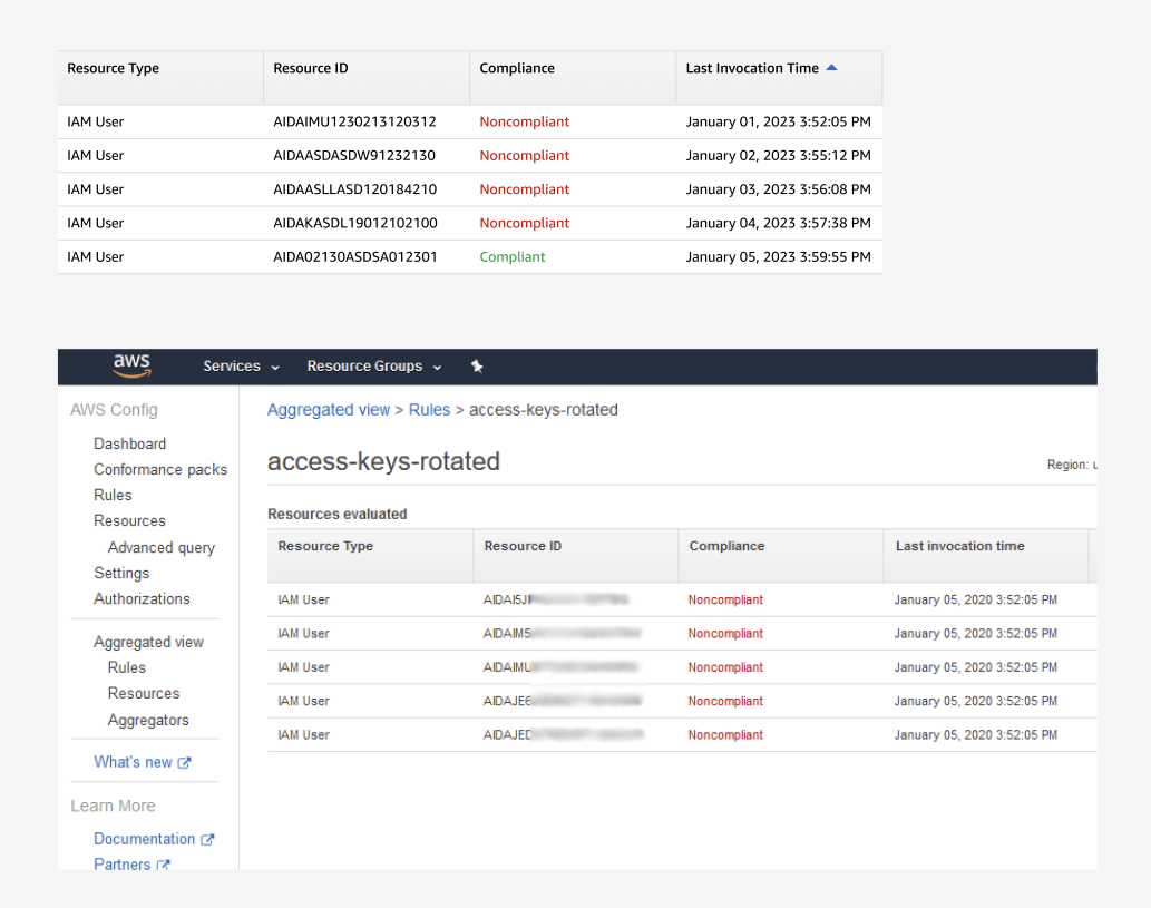
mage Credit: Greg Nudelman. Above: a simple AWS table created using the 3-minute table approach. Below: an AWS table example from documentation (source: https://aws.amazon.com/blogs/mt/managing-aged-access-keys-through-aws-config-remediations/)
You can download an example Figma file for building a typical Amazon AWS table here.
(NOTE: you might need the Ember Display font available from Amazon: https://developer.amazon.com/en-US/alexa/branding/echo-guidelines/identity-guidelines/typography)
You are welcome.
Finer Points Explained
Here are a few of the finer points for the design system connoisseurs:
First, an essential point for table cells: you don’t need to create mouse over/hover/click states. You should instead document the color and appearance changes carefully and completely in your design documentation, and then you should forget all about it. We repeat: Do not create mouse over/hover/click states in your components, and don’t add them to your tables. Most systems will only need two cell states: default and selected. The same goes for the headers: default, sorted up, sorted down. No mouseovers anywhere. (See the section below on “advanced animation” as to the discussion of why.)
We recommend creating a bare minimum of cell types and generating the necessary columns from those simple design elements. It just makes the entire system much more straightforward, faster, and easier to use, which is the exact point of the exercise.
Create realistic minimal content – we found that a header row plus exactly FIVE (5) rows of content in each column is the best compromise between the fullness of content variation and the amount of work it takes to edit the values. (NOTE: Think VERY carefully if you need more than five rows because that decision will create extra work for everyone on your team for the foreseeable future!)
Each of the Number, Date, and Duration columns that make sense to be sorted should have a preset sort going “up” and “down” (FIFO/LIFO) and have the corresponding sort order indicated in the header.
If your system uses funky specialized IDs and types, you consider multiple types of “Name” columns with left-aligned text and content corresponding to these specialized elements (see above how we handled the ID, Name, and Type columns in our sample file). There is no reason designers need to create custom content for these frequently used columns. The same goes for Numbers, which might include columns of five Integer, Percent, and Decimal numbers sorted by FIFO/LIFO. Also, consider Date columns with different formats and durations.
Lastly, if you have too many column variations for a single list, consider splitting them into groups of Name, Number, Date, Status, etc. Discuss with your cross-functional team what would make it easier and faster for your designers to create tables more consistently – after all, that is the point of the exercise!
Benefits of the 3-Minute Table Solution
When implemented correctly, the 3-minute table solution provides the following benefits:
Ability to assemble a complete table in under 3 minutes.
The standard way to build tables, re-arrange or replace columns live on Zoom call.
Realistic column types: name, number, boolean, date, duration, URL, etc.
Preset realistic content (five rows worth).
Example of the standard column name matching content, e.g., “Enabled” for the boolean and “Created At” for date.
Correct cell alignment is included with the cell type.
Correct text wrapping is included with the cell type.
Correct column resizing and text truncation behavior using built-in Figma capabilities (no plug-ins needed).
Show and allow pre-set column sorts where they make sense (for example, two “date” columns sorted in LIFO and FIFO, e.g., “up” and “down,” so you don’t have to do this manually, same for numbers and duration columns, where the table is sorted by those columns.)
Finally, the most crucial part: Agreement! All UX, Dev, and PM team leads need to agree to these 20-40 columns. If any different type of column is invented at any point in the future, it will need to be reviewed and approved by the team in order to be added to the library and implemented in code. This helps to short-circuit any foolhardy spur-of-the-moment ideas in favor of re-using existing standard column types. Conversely, if a new type of column is needed, it can be easily called out, coded, and added to the system without disrupting the current work.
What does any of this have to do with AI?
We’re glad you asked.
When typical people encounter a door, they do not stop and go, “OMG, I don’t know what that is!” they understand that despite some variations, a door is a relatively simple object: it can open out, in, or sometimes slide left or right. Doors have a variety of handles; they can lock from one side, from both sides or have no lock at all. Doors can come painted with a variety of colors. Nevertheless, most of us can easily recognize a door and open it easily. Why, then, despite so many examples of tables, do we refuse to treat our table design and development the same way we treat opening a door?
Simple prototypes are robot work. AI work.
This goes double for tables. You should have a simple, consistent, repeatable design process for every time you need to have a simple table on your page. It should take about 3 minutes to make one. Ideally, live on a three-in-the-box Zoom call (UX, PM, Dev Lead).
Creating tables is the perfect example of the work best done by robots/AI. And it will be done by machines in a very, very near future, end-to-end, soup-to-nuts, design-to-code (see our very first column installment: UX is Dead). So, if you want to lead in the age of AI, you need to prepare for the day simple designs will be done by machines. Nay, not just prepare – you need to hasten the arrival of this glorious future by systematically identifying and removing any kind of robot/AI work from your daily responsibilities as a designer.
It all starts by minimizing how much time you spend putting together tables.
Instead, we recommend you focus your time on what humans do best: adding maximum value to your team through creative thinking, rapid iterative user research and design, understanding how your company makes money, discovering how the market is evolving under the pressures of AI, helping shape the product strategy, filing patents, and ensuring ethical product development practices that sustain our global environment, protect human rights, and benefit humanity as a whole.
Are you ready?
What about advanced animation, new from Figma?
In the immortal words of Dr. Ian Malcolm:
“Your scientists were so preoccupied with whether they could, they didn’t stop to think if they should.”
– Jurassic Park, Universal Pictures, 1993
As a rule, animating simple prototypes is wrong. It’s bad for the UX industry, it’s bad for stakeholders, and it’s bad for companies.
If you condition your stakeholders to expect pixel-perfect animated prototypes for everything, you will always be expected to create them.
Evermore.
Simply put, Figma is wrong in driving this kind of expectation for every prototype.
You do not need to implement and user test mouse-over or click colors whenever you build a simple element (like a table). There is no value in doing that. That’s assuming you validated those colors a long time ago (and you did do that, right? Right?!)
Thus, you should only spend time adding animations to your designs for prototypes where animation is part of the interaction design: complex asynchronous Ajax interactions, AR/VR, or some other interesting novel UI interaction modes and mission-critical HTML 5 features you are testing with customers.
For example, among a few other things, Greg carefully designed and user-tested the animations for the Webex “share” action and various animated mobile and check document scanning workflows for USAA, Intuit, and Wells Fargo. Our advice is to be ruthlessly selective about what you choose to animate in your prototype.
Gratuitous animation prettifies – it does not add value. Worse: it DISTRACTS.
Animation everywhere in your simple, early design prototypes creates unrealistic expectations of the level of design completion for your team, your partners, and your evaluators. If your design is not finished but beautifully animated, everything else will look broken by comparison. The animation will draw evaluators’ attention during user testing, distracting everyone from the real issues with your design.
Bottom line: don’t spend your time animating table rows – leave the robot work for the AI.
Learn to code Python instead.
Learn French.
Or knitting.
Or underwater basket weaving.
In Conclusion: Minimize Robot/AI Work Your Team Has To Do
Of course, there will always be edge cases where you have unique tables that need extra TLC, and you may have to do something special and creative there. And that’s OK. Our goal here was to help you minimize the Robot/AI work your team needs to do whenever they need to design and develop a simple standard table.
After reading this column, you know how to create simple table components that will allow your design team to assemble a simple table in less than 3 minutes. If you choose to do something else, that is entirely up to you. Our advice is to carefully consider the impact your choice of design components will have on the level of effort your team needs to spend using them.
We sincerely hope you found this column helpful. It is part of our newsletter: “UX for AI: How to Escape the Animated Table Hell”.... Ahem, just kidding, it’s called “UX for AI: UX Leadership in the Age of Singularity,” and you should click that [Subscribe] button right now because you won’t want to miss our most important issue yet, coming next week!
Down and Out in the Kingdom of Robot Overlords,
Reply